
9 Tips to Get Publication Ready Flow Plots
- Jun 10, 2020
- 6 min read
- Sharon Sanderson, PhD
Flow results are very visual, so we all want to achieve quality data to enable us to present the best possible images. In this blog, we will share some top tips to generate publication-worthy flow plots. It is vital to have an optimized staining protocol and panel, good quality samples, and the right controls. However even with the right experimental plan, some small changes can improve your data by reducing staining artefacts, achieving better resolution, and analyzing/presenting data in a format that flow experts and journal reviewers would like to see.
1. Optimize Your Cytometer
Your cytometer should be regularly checked to identify any performance issues, for example by running a daily quality control (QC). Your instrument may plot this QC data like photomultiplier tube (PMT) voltage and coefficients of variation (CVs) of single peak QC beads, as Levey-Jennings plots. This allows you to look at the cytometer's performance over time. It’s essential to have your cytometer working at its best for accurate and consistent results.
The voltage settings of the detectors in your flow cytometer (e.g. PMTs) affect its sensitivity and therefore data quality. The voltage for each detector should be optimized. One way to achieve this is to use a voltration method. One tube containing beads or cells stained with a single fluorophore-conjugated antibody should be run at a range of voltages and the data collected in the fluorophore's optimal channel (Figure 1). The ideal voltage for that channel is one that gives the best resolution without causing spread of the negative cell population, which can be calculated using a stain index calculation. In this example, the highest stain index corresponds to a voltage of 400 V. This experiment needs to be run for all of the channels that you will detect.
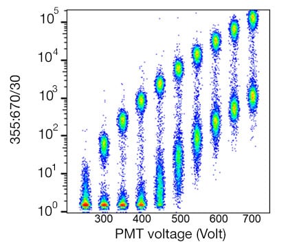
Fig. 1. Human peripheral blood mononuclear cells stained with Anti-Human CD4 Antibody. Cells were stained and data acquired on the ZE5 Cell Analyzer with increasing PMT voltage in the optimal fluorophore detector.
After finding the optimal voltages, you need to check in your flow experiment that the brightest fluorescent signals do not exceed the upper limit of detection. If they do they will be off the scale and data will be lost. In this case, the voltage should be reduced until the positive cells are on the scale.
2. Titrate Your Antibodies
Using too much antibody will increase background staining. This results in the spread of your negative population and causes the whole negative population to shift to the right as shown in Figure 2. In this example, reducing the antibody to 1/16 of the initial concentration gives better resolution with a tighter negative population that has a lower mean fluorescence intensity (MFI).
Learn How to Titrate Antibodies
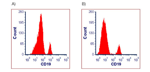
Fig. 2. Human peripheral blood lymphocytes stained with Anti-Human CD19 Antibody. Cells were stained with a live/dead marker and A, 10 µl of Anti-Human CD19 Antibody or B, 0.625 µl of Anti-Human CD19 Antibody before data acquisition on the ZE5 Cell Analyzer. Cells were gated on live, single cell lymphocytes and the expression of CD19 plotted as a histogram.
3. Centrifuge Antibody Master Mixes
Aging antibodies that have been sitting in a fridge for a few years can start to aggregate. Centrifuging these antibodies before your staining will remove antibody aggregates. This will improve your data; antibody aggregates appear as bright events that could be mistaken as positive cells.
4. Include a Live/Dead Marker
Dead cells are known to autofluoresce and bind nonspecifically to antibodies. Dead cells increase negative spreading and can give false positives. Gate out dead cells by including a live/dead marker in your staining panel.
5. Forward and Side Scatter Plots Gating
In a gating strategy, usually one of the first couple of plots to be drawn is a forward /side-scatter (FSC / SSC) area, or height plot. This is a great starting point to detect your cells of interest as it removes events that are not of interest for your analysis. However, care should be taken not to be too stringent with your gating. In this example for human peripheral blood (Figure 3), a gate is drawn around the lymphocytes but, as you can see in A), when it’s too tight you lose some of your CD4+ cells. When a slightly larger gate is used, as shown in B), 30% more CD4+ cells can be identified. While stringent gates can be useful, take care not to lose the population you are interested in.
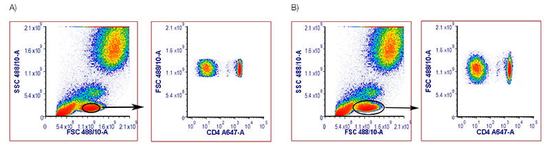
Fig. 3. Human peripheral blood stained with Mouse Anti-Human CD4 Antibody, clone RPA-T4 (MCA1267A647). Red blood cell lyzed blood was stained with a live/dead marker and Anti-Human CD4 Antibody and data acquired on the ZE5 Cell Analyzer. The live single cells were identified: a tight A, or a slighter larger gate B, was placed around the lymphocytes in a FCS/SSC, and these cells plotted onto a FCS / CD4 A647 dot plot.
6. Doublet Exclusion
Doublets in flow data occur when two cells pass through the laser at the same time. There are three reasons to include doublet exclusion in your analysis. Firstly, if both cells bind the same fluorescent antibody, the event will appear brighter than a single positive cell. Secondly, doublets can give false positives when the doublets contain one positive and one negative cell. This is a big problem in cell sorting as both cells would be sorted and it decreases the purity of the sort. Finally, you may get some strange staining patterns. For example, if a doublet consists of B and T cells they would appear as both CD3+ and CD19+.
Doublets are easily identified from single cells by plotting height or width against area on forward or side scatter. Which you use is mostly down to personal preference, but for a cytometer with a narrower beam area, using width will give better discrimination. For samples with a high number of doublets, two sequential gates can be used; plotting area against height followed by area against width. You may only exclude a few doublets, but in the case of very sticky cells, this simple extra step can make a big difference to your data.
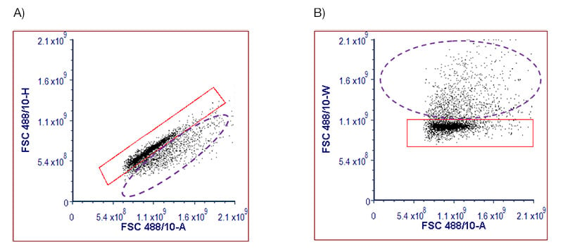
Fig. 4. Single cell identification in porcine splenocytes. Splenocytes were stained with DAPI and acquired on the ZE5 Cell Analyzer. The DAPI- live cells were plotted onto dot plots using either A, FSC-A versus FSC-H or B, FSC-A versus FSC-A. The single cells can be found in the red gates and the doublets, in the purple dotted gates.
7. Choose the Most Appropriate Plot for Your Data
Histograms can hide small populations and make the data look cleaner than it actually is. Reviewers are aware of this and journals sometimes prefer to see data presented as two parameter plots, with the exception of cell cycle and proliferation analysis. In histograms, rare cell populations become lost; using a dot or contour plot can make them more visible. Figure 5 shows the same data expressed in three different ways, the small IgD- population can’t be seen in the histogram, but when presented as a two parameter dot plot or contour plot it can be easily identified.
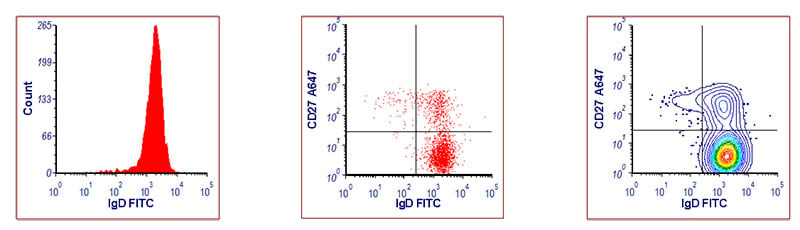
Fig. 5. Identification of B cell populations in human peripheral blood. Red blood cell lyzed peripheral blood was stained with a live/dead marker, CD19 AMO, IgD FITC, and CD27 A647. Data was acquired on the ZE5 Cell Analyzer. Cells were gated on live, single, CD3-, CD19+ lymphocytes. On the two color plots, multiple B cell populations are detected; small class-switched memory cells (CD27+ IgD-), non-class switched memory cells (CD27+ IgD+), and naïve B cells (CD27- IgD+).
8. Consistent and Meaningful Labeling of Axes
The axes on plots should not be labeled with the instrument-specific parameter description, for example, FL-1. Instead, it is more appropriate to use the antibody and fluorophore used or the laser and filter combination.
When comparing data across different samples, ensure that your plots have identical scales on the axes. It takes longer and it is harder to identify differences between multiple samples if some data is shown on a biexponential scale and others on a log scale. For plots using FSC or SSC, be consistent in your use of the area, height, or width parameters for each sample in your experiment.
9. Show Your Gating Strategy
In an immunophenotyping experiment, you may only be interested in one particular cell population, but how did you get to that cell population? Show at least one example of your gating strategy to demonstrate how you identified them. Setting gates can be very subjective, so it is best practice in multiplexed panels to determine where to set gates using fluorescence minus one (FMO) controls as these take into account spreading caused by compensation. For peer-reviewed articles, this data is often contained in the supplementary information rather than in the main body of the paper. Not only does it show you’ve identified the correct cells of interest, but it also helps other researchers that wish to identify the same cell population.
Not Sure on Which Controls to Include?
Get to grips with flow controls with our bite-sized webinar shorts featuring compensation controls, viability controls, isotype controls, and other controls.