
Top Tips for Presenting Your Flow Data
- Mar 11, 2024
- 5 min read
- Chloe Fenton, PhD
One of the great things about flow cytometry is the large amount of data you can collect from a single experiment. At the same time, this mountain of data can also be a significant source of stress when you have no idea what to do with it. The presentation of your data is, however, essential as it allows you to communicate the results of your project accurately and concisely.
In this blog, we cover some key considerations to keep in mind when presenting your data, with a particular focus on the differences between an external and internal audience.
What’s a Few Plots Between Lab Mates?
When utilized properly, internal presentations, in which you present data to your own research group, can be your best friend. Such presentations provide you with the opportunity to get opinions and criticism of your data and ideas in a more informal and (typically) friendly way, allowing you to strengthen your conclusions prior to a publication attempt.
So, how do you make the most out of these situations? Well, simply put, you should try to show as much detail as possible. While you may streamline your plots and figures for publication, showing the finer details to your lab mates will help them spot any areas of weakness that may require fortification.
For example, label the axis of your dot plots in full, not just with the marker of interest and the scale, but also the fluorescent dye and the laser and filter used. Show your gating strategy in full and mark the percentage represented by each gated population of interest, as dot plots can be difficult to assess by eye alone. It is also beneficial to show your controls to enable your colleagues to check the quality of your experiments.
Figure 1 shows an example of good data presentation for internal presentations. The scale on the axes clarifies whether a log or linear scale was used, the axes are labeled with the fluorescent dyes, lasers, band pass filters, and target protein, the percentage populations are shown for each gate, and the gating scheme is clear.

Fig. 1. An example of good data presentation for internal presentations. Example data showing gating scheme and correct labeling of human peripheral blood stained for regulatory T cells.
Remember, everybody makes errors from time to time, and it is better for your lab mates to catch any mistakes early on before progressing further down the wrong route. This is also a great opportunity to learn best practices from more experienced members of your team and work on your presentation skills!
Venturing Outside Your Comfort Zone
While the previously suggested style is the most accurate way to present your data, it is not optimal for every audience. For external audiences, such as talks at conferences or presenting your data in a publication, adding every detail will likely be overwhelming and make your results difficult to read in the limited space available. In these situations, you should focus on clarity.
First, you will need to prioritize your data, as often there are time limits for presentations or a restricted number of figures allowed in a publication. So, you will need to choose the most important data that tells your story accurately and concisely.
Figure 2 shows an example of data presented for internal use (on the left) and external use (on the right). You can see that the plots on the left are extensively labeled with every population quantified, making them more difficult to read with limited space. On the right, the features of the plots are modified to remove any unnecessary information, such as the boxes around the plots and the percentage of the populations that are not of interest. The information on the axes has been reduced to only the marker and fluorescent dye, which allows the font size to be bigger and easier to read at a glance.
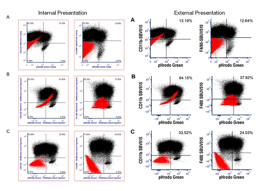
Fig. 2. Internal vs external presentation of data.
Minimize the Stress of Publication
Before preparing your figures for a paper, it’s important to familiarize yourself with the submission guidelines of the journal you are aiming for. This will often include things like minimum image resolution, maximum figure size, maximum number of figures, maximum number of panels per figure, and font type and size that should be used.
Unfortunately, you may not be successful with your first choice of journal and may have to consider resubmitting elsewhere. Therefore, it’s often a good idea to format your figures in a way that is broadly acceptable to a wide range of journals to avoid having to start back at square one. For example, almost all journals will accept figures in a resolution of 300 dots per inch (dpi) or above. The majority of journals will publish in A4 or letter size so make sure your figures will comfortably fit in this format and use a font that is clear and big enough to be easily read at this size. You can print out your figures to check how they will look on the page.
A helpful tip that could save you a lot of time in the long run is to use a dedicated publishing program to make your figures. This involves taking a little extra time in the beginning to remove the numbering and text (including axis labels, axis numbering, and figure legend text) and then reapplying these using the publishing program. This means that changes to the figures can be handled quickly and easily in the publishing program rather than having to go back to your analysis software. This simplifies the process of reformatting if you’re paper is rejected and has to be resubmitted to the next journal.
Lastly, let’s talk about color. Color figures will generally incur an extra charge, so having a lot of color can be expensive. Density plots are the most widely used 2D plots for flow data in publications, so you will often need to bite the bullet and pay the extra money to include these in color. If you want to avoid an extra color charge in your other figures, like bar charts, make sure they are easily interpreted in black and white, for example, use symbols or textures to indicate different groups. Make sure your groups are easy to distinguish from each other and as distinct as possible. A final consideration to make when you do use color is that using red and green can make your data inaccessible to people with red/green color blindness. Instead, why not choose a combination like blue and yellow?
While the focus of this blog is on data generated by flow cytometry, a lot of these principles could also apply to data generated from other applications. With these tips in mind, we hope you feel more prepared to tackle the world of data presentation and to tailor your presentation style to specific audiences. Now go publish some papers!
Are You New to Flow Cytometry?
If so, why not enroll in our Fundamentals of Flow Cytometry course, a free ten-part Flow University to teach you all about the basic of this technique?